Design Principles
Technical Workflow
The data on which our map is based was initially pre-processed in ArcGIS, where the datasets were prepared, clipped, and up-sampled. The implementation of the interactive web map was done with R-Shiny, while the website structure itself was created using HTML.
Conceptual Design Framework
To ensure that the application is intuitive and user-friendly, we followed both general cartographic principles and literature discussed during the course. At the beginning of the design process, we defined the three central pillars of our web map design: theme, audience, and purpose (Fabrikant & Goldsberry, 2005).
Theme
The theme of the project is Shadow Routes in the City Center of Zürich.
Audience
The application is primarily aimed at non-expert users, especially vulnerable groups such as people with health problems, pregnant women, families, elderly people, and generally anyone interested in avoiding direct sun exposure during hot summer days. Because the application is designed for vulnerable population groups, special attention was given to color contrast, simple interactions, and the use of understandable language.
Purpose
The purpose of the application is to provide a practical adaptation measure during future heat waves and increasingly hot summers. The system is intended to support a broad urban community by helping users identify cooler and more comfortable walking routes through the city. These principles strongly influenced our decisions regarding layer selection, interaction design, symbolization, and the overall structure of the website and map interface.
Initial Design Sketch
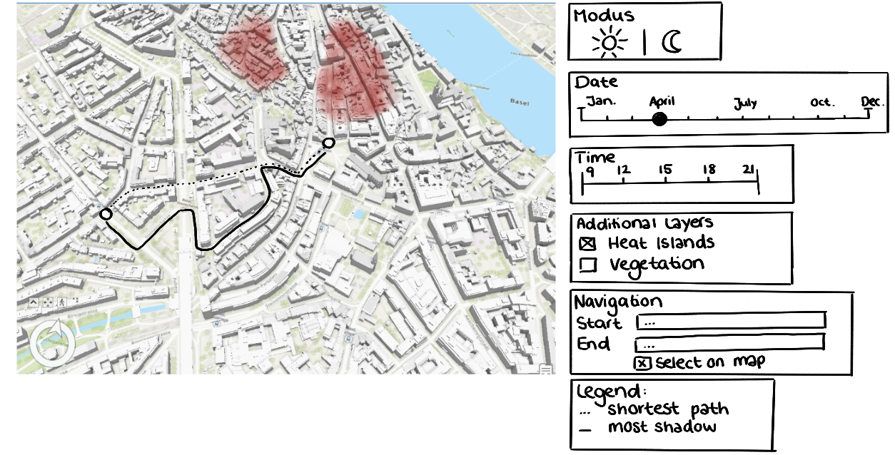
Early conceptual sketch of the web map interface and interaction design.
Map Design
From the beginning, we had a very clear vision of how the map should look and function, and most of the initially planned design elements could be implemented successfully. Our main goal was to create an intuitive interface without overloading users with unnecessary information.
We intentionally oriented the interaction design towards commonly known navigation services such as Google Maps, Bing Maps, and OpenStreetMap. Familiar interaction patterns can reduce cognitive effort and make applications feel easier and more intuitive to use (Roth, 2013; Sack, 2017).
Dark Mode and Sustainable Design
An important aspect of our design was the implementation of a default dark mode for the website. Inspired by the literature on sustainable and energy-conscious cartography, we considered the energy consumption of websites and web maps during the design process (Wu et al., 2024). Unfortunately, due to technical limitations, the dark mode could not be fully implemented for the web map itself.
Temporal Visualization
Several aspects changed compared to our first design sketches. Besides changing the study area from Basel to Zürich, we also reconsidered how temporal information should be visualized. Initially, we planned to implement a continuous time slider. However, after evaluating the complexity and usability of this approach, we decided that a toggle menu would provide a clearer and more intuitive interaction.
Shadow rasters were calculated for June, July, and August, using the 15th day of each month as a representative example. For each day, shadows were calculated at 09:00, 12:00, and 15:00 o'clock. Allowing users to select one month and one time step through toggle menus simplified the interaction and reduced unnecessary complexity.
Navigation and Zooming
The default zoom level focuses on the city center of Zürich, which represents the primary area of interest. Users can zoom in and out using plus and minus buttons located in the upper-left corner of the map interface. This interaction closely follows the zoom functionality commonly used in Google Maps and other web mapping services.
As Harrower and Sheesley (2005) argue, there is no universally ideal implementation of zooming functionality, since user preferences differ. However, familiar zoom interactions often feel the most natural to users and can therefore facilitate map interpretation and usability. Because our zoom interaction mirrors used navigation platforms, we believe that most users can use it intuitively.
Color Scheme and Symbolization
For the route calculation, the shaded route was visualized in blue, while the shortest route was displayed in red. These colors were intentionally selected because blue is commonly associated with coolness and shade, whereas red is often associated with warmth and heat. Additionally, the selected colors are distinguishable for many forms of color vision deficiency.
The heat layer was visualized using a continuous color scheme appropriate for continuous temperature values. Following Roth (2017), more saturated and warmer colors are associated with higher values and stronger heat intensity. In general, the selected colors were inspired by the ColorBrewer framework, which is particularly suitable for geospatial visualizations and colorblind-friendly cartographic design (Harrower & Brewer, 2003).
The shadow rasters were intentionally visualized using dark tones for areas with high shadow intensity and lighter tones for areas with low shadow intensity. This decision reflects intuitive human associations with shadow and supports easier interpretation of the map content.
Basemap Design
We selected a minimalistic basemap design to avoid visual clutter and maintain thematic focus. At the same time, certain contextual information remained important for orientation and navigation, including street names, building outlines with house numbers, and general land surface categories such as green spaces. This simplification process follows principles of cartographic abstraction and cognitive load reduction (MacEachren, 1995; Montello et al., 2018).
Final Webmap
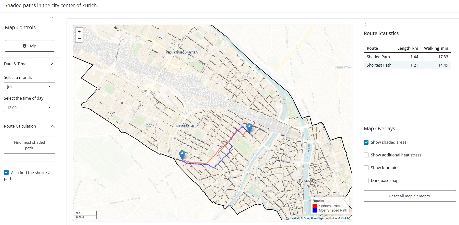
Final webmap with planned route.
Layer Design
Shadow Maps
Due to computational limitations, the shadow rasters were clipped to the street network. Although this may initially appear visually unusual, it simplifies interpretation by clearly emphasizing the navigable shadowed areas relevant for pedestrian routing.
Heat Layer
To illustrate additional heat stress within the study area, we included a temperature dataset from meteoblue representing summer heat conditions in 2025. Since temperature is a continuous variable, a continuous visualization approach was selected.
Fountains
Fountains were visualized as simple blue point symbols. Blue is strongly associated with water, and point geometries are appropriately represented using point symbols. We also considered using more decorative fountain icons, but ultimately decided to use simple symbols in order to remain consistent with the overall minimalistic design language.
General Layout and Interaction Design
Panel Structure and User ControlThe interface is divided into a left and a right panel to separate interaction tools from additional information. The left panel contains the route calculation and map controls, while the right panel displays route information (route type, route length, estimated walking time) and additional data such as heat information and route statistics. This statistical information supports route comparison and helps users evaluate whether additional walking distance is worthwhile in exchange for increased shade. Both panels can be collapsed and expanded by the user. This gives users more control over the interface and allows them to adjust the visible map size depending on their needs (Roth, 2017). The collapsible design also helps reduce visual clutter and keeps the interface flexible and easy to use (Ooms & Skarlatidou, 2018).
A help button positioned in the upper-left corner explains the most important interactions and functionalities of the map. All major interaction elements are directly visible when opening the application, ensuring that users are not required to search for hidden content.
Areas outside the routing network are visually separated using a black boundary and blurred surroundings to reduce confusion regarding the area of interest.
The route point symbols were inspired by the interaction logic of Google Maps. Hovering over points reveals start and end labels to avoid confusion. The first selected point automatically becomes the start point, while the second becomes the destination. Selecting another point resets the route and creates a new start point. Additionally, when a new route point is selected after a route calculation, the previous route remains visible temporarily. This design choice helps users recover from accidental clicks and avoids unnecessary frustration.
Although the study area is located in Europe, we decided to include a scale bar displaying both metric and imperial units in order to improve accessibility for international users.