Choropleth Map
Maps - Click on the map
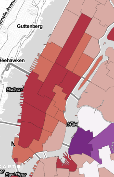
The following Choropleth maps shows the difference of the Uber Pickups between two days. In the first map, the difference between the thursday the 3.07.2014 and thursday the 17.07.2014 are presented. In the second map, the difference of the friday the 4.07.2014 to the friday the 18.07.2014 are shown. As the 04.07.2014 is a national holiday, this maps are considered to show that there is a different behaviour of the use of Uber depending on if it is a weekday or a holiday. The third of july is thereby a specific day - the day before holiday.
Data processing
In a first step, the four days were processed individually. For each day, the count of uber-pickups has been calculated for each Neighborhood tabulation area (NTA). Then, this dataset has been joined to the population of the NTA's. This allows to normalize the count of pickups per 100 population. Consequently the end dataset of each day contains the 'NTA-Code', 'NTA-Name' and 'count per 100 population'.
Now two new datasets have been created. The first one contains the difference 'count per 100 population' between the third and 17th of july and the second the difference of the same attributes but of the 4th and 18th of july.
The choropleth map presents a useful visualization of these comparisons. To create such a map, the values must be classified. As pointed out by Evans (1977), the choice of classificatin is highly dependent on the purpose and there is no general rule. The important property of these change rates is, that there are negative and positive values. The classification was done manually, such as there are three classes for negative and positive values and one neutral.
Before we present our interpretation and discussion, please have a look by yourself on the outcome! You can zoom in and out, get more information to the population and to each day by selecting the layers on the right or by clicking into the units.
Interpretation and Discussion
Thursday
The differences of the two thursdays are not very high. Most of the units are colored in grey or light red what indicates a slightly negative change. This means that in most of the units, on the day before the national holiday and a usual workday, the use of Uber has been similar. The other classes are equally distributed. But it is important to check the distibution within the classes. The range of the negativ values is much higher than the range for the positive ones. This means that over all the Uber pickups has increased in the second week and that the use of Uber has been lower on the day before holiday. This is shown very clearly in the center of Manhatten.
The dataset only shows the difference over the whole day. As the third of july is a public holiday it is possible that people leave sooner than usual. Consequently the high deviation on some of the units would be due to the early evening. To get an answer to this assumtion, we present a different method. You can see by yourself if you can find such a described behaviour in the animated map.
Friday
The differences of the use of Uber on a public holiday and a weekday can be shown very clearly in the second map. As we have calculated the friday of holiday minus the weekday-friday, we can see that the use of Uber is much higher on a weekday in most of the units. The increasing use of Uber in the center is even more clear on this map.
The choropleth map gives only information about the whole unit. It can not show specific points of interests. Maybe the count of Pickups in one unit is due to a specific place as an airport or a mall? To check this, we suggest to analyse the data by an animated map.
Get some more information on the interpretation of this results
here.
Questioning methods
For the interpretation of the maps, it is important to have a closer look to the classes. The most important property is the range of each class. The range of the negative classes is thereby much higher than for the positive classes. This does not improve the visual analysis but it was important to us to have a neutral class and the same count of classes for negative and ppositive change. Also we wanted to have the same kind of legend for both maps. Methods as equal interval or quantile did not improve the visualization. This difference in range means that the already dominating read classes must be weighted even more. The results gets thereby even more clear.
By comparing the two maps it is important to be aware of the different ranges all over the dataset. While the first map conains values from -199 to 1.54, the second map shows values from -241 to 5.5. As the differences of these ranges are not so big, we can compare the two maps. We can conclude that there is already a higher use uf Uber on the day before holiday and there is even a higher use of the service on a public holiday compared to usual weekdays.
References
Evans, I. A. 1977. The selection of class intervals. Institute of
British Geographers Transactions, New Series 2 (1): 98–124.
https://www1.nyc.gov/site/planning/data-maps/open-data/dwn-nynta.page, 2016 (access: June 2017)

