Beyond the Trees:
Visualizing How Forest Loss Affects Red List
Species Around the World
Welcome to this interactive project exploring the relationship between global forest
loss and biodiversity!
We are a group of Geography students from the University of Zurich,
and this website was developed as part of the Master’s module GEO454 Geovisualization,
taught by Prof. Dr. Sara Fabrikant, as an academic project focusing on spatial data
visualization and environmental analysis.
Background
Exploring Biodiversity and Forest Loss Data
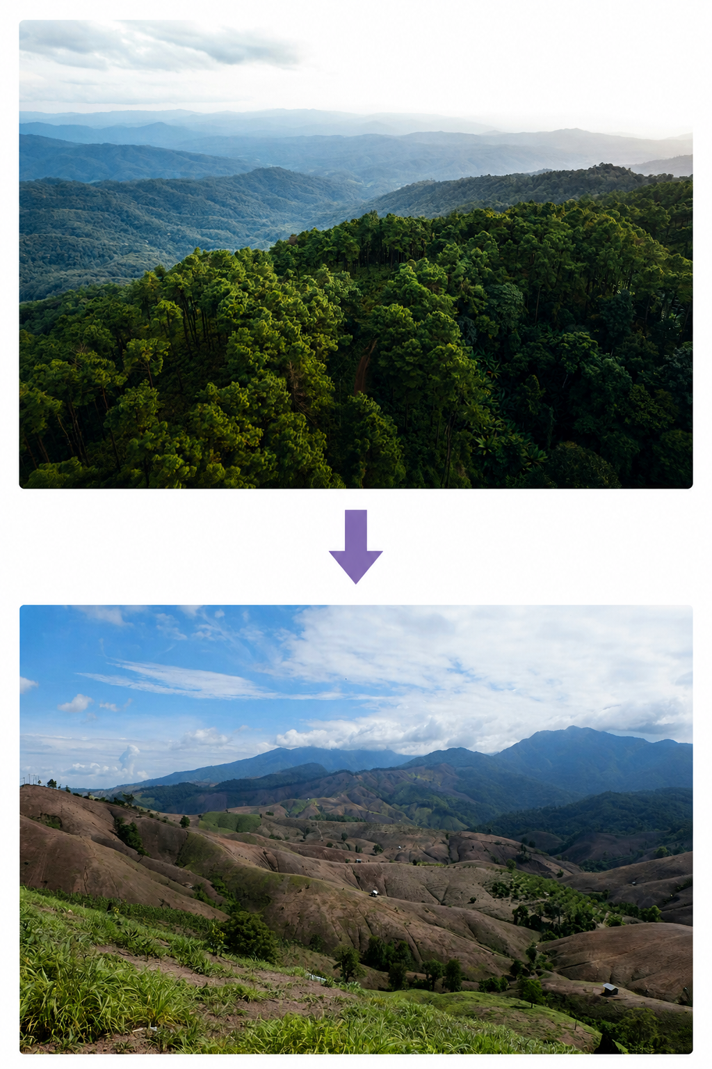
Deforestation remains one of the most critical environmental challenges of our time, which has a profound impact on our ecosystem. Forests are not just a collection of trees. They are complex ecosystems that regulate our climate and provide a home for a large portion of global biodiversity. Nevertheless, large forest areas are destroyed every year, which has severe consequences for various species (Betts u. a., 2017; IPBES, 2019).
Research shows that increasing forest loss is one of the main drivers of global biodiversity decline. When forest habitats increase and become more fragmented, species numbers drop, and the likelihood of extinction increases, especially for species that are dependent on forest ecosystems (The IUCN Red List, 2024; Feurer u. a., 2025).
The relationship between forest loss and threatened species is therefore tied to specific places, regions with high biodiversity often overlap with regions experiencing high deforestation pressure. This makes it possible to identify global hotspots where biodiversity is most at risk by combining forest cover loss data with species richness and Red List species data (Hansen et al., 2013; IUCN, 2024).
By integrating these datasets, this project explores how environmental pressure and biodiversity vulnerability intersect in space. In particular, our website focuses on how patterns of forest loss relate to the distribution of threatened species listed on the IUCN Red List, which is one of the leading global assessments of species extinction risk.
Research question:
Against this background, the project addresses the following research question:
Which countries show the highest potential risk of biodiversity loss due to the overlap of high forest cover loss and high species richness in 2024?
In this study, risk refers to the spatially inferred potential for biodiversity loss, based on the overlap between high forest cover loss and high species richness in a given area. It does not represent a directly observed probability of extinction, but rather a combination of environmental pressure and ecological sensitivity.
Empowering Spatial Discovery
This website is designed as an interactive educational tool to help users uncover the complex relationship between forest cover loss and biodiversity. Instead of just observing static data, users are invited to become researchers. By utilizing data from Global Forest Watch and the IUCN Red List, the platform offers several ways to visualize environmental change (Global Forest Watch, 2014; The IUCN Red List, 2024).
Multilayer Analysis
Users can examine patterns through different lenses, such as combining choropleth maps of forest loss with proportional symbols representing species richness.
Bivariate Mapping
Advanced spatial visualizations allow users to see exactly where high deforestation and high species endangerment intersect.
Temporal Exploration
An integrated time slider tracks forest loss patterns from 2001 to the present. This makes it possible to identify how biodiversity hotspots have changed over the decades.
Education for Sustainable Development
This website aligns directly with the United Nations Sustainable Development Goals (SDGs). It focuses specifically on SDG 13, which focuses on climate action and aims to reduce human impact on the climate, and SDG 15 regarding Life on Land, which is about protecting ecosystems and preserving biodiversity. Our platform aims to raise awareness of ecosystem protection and the urgent need for conservation efforts (United Nations, ohne Datum).
Target Audience
This website was developed specifically for learners aged 16 to 18, including those in vocational training or apprenticeships. It bridges the gap between complex environmental data and classroom learning. This website serves as a dynamic resource for teachers to spark discussions on sustainability, geography, and the global consequences of human impact on nature.
Data sources
To answer this research question, data from two central sources are used: Global Forest Watch provides comprehensive information on global forest loss based on satellite data, while the IUCN Red List offers detailed data on the threat status of species. By combining these datasets, the relationships between forest loss and biodiversity loss can be visualized.
IUCN Red List Species

For our project, we obtained biodiversity data from the International Union for Conservation of Nature (IUCN), which runs the IUCN Red List of Threatened Species, one of the world's most important databases on the state of biodiversity. The IUCN Red List categorizes animal, plant, and fungi species according to their risk of extinction. This assessment is based on scientific literature, expert reviews, monitoring data and modelling.
The data we used comes from the official IUCN website, which provides downloads of spatial data on species richness from around the world. For our project, we used the dataset 'Species richness – all Red List categories'. This dataset shows global species richness as raster-based spatial information, where each raster value represents the number of species occurring within a 10x10 km cell. The species richness map and the bivariate map were created using a combined dataset of the following taxonomic groups: reptiles, amphibians, mammals, birds, freshwater crustaceans, and freshwater fish. Separate datasets on reptiles, amphibians, mammals and birds were also used to create a bar chart for each country.
An important limitation of the data is that it is based on modelled distribution areas rather than precise observations. The data quality also varies based on taxonomic group and region, and some groups may be under- or overestimated.
Link to website with data description and download: https://www.iucnredlist.org/resources/other-spatial-downloads
Global Forest Watch
For our project, we obtained the Forest Loss Data from the Global Forest Watch Organisation (GWF). The GWF is an initiative from the World Resources Institute (WRI) and aims to provide the best publicly available data and tools for monitoring and protecting forests around the world. The GWF uses Satelites to classify the surface cover of the planet, thereby gaining information about the tree cover density around the world. Through their time series and observing the groundcover change of any given pixel, they can then estimate the potential growth or loss of tree cover. The GWF distinguishes forests by different levels of Canopy cover, and Forest Loss is attributed if there is Tree cover Loss of at least 50% within a 30x30m pixel. They can furthermore distinguish between eight different drivers behind the loss of the forest. This is done by analysing what new ground cover class occupies a previous forest pixel. An important limitation of the data is that the driver of the forest loss is only based on ground cover change and may not tell the full picture. So, wildfire as the result of cut-and-burn farming practices would still be attributed to wildfire and not Agriculture. Furthermore, this data is based on satellite image data with varying resolution, leading to similar uncertainties as our Biodiversity data. Link to website with data description and Download:
Link to website with data description and download: https://data.globalforestwatch.org/documents/85caa1aa8de2422894f6c1f11ae1d524/explore
Interactive map: Risk of Biodiversity Loss due to Forest Loss (2001-2024) and occurrence of Red List species (2024)
Red List Species Richness & Forest Loss Map
The map about species richness is a choropleth map that shows the number of red list species (per km2) occurring in different countries. Each country is shaded in blue according to its species count: lighter colors represent lower counts, while darker shades indicate higher ones. The species richness values are normalized by country size, enabling fair comparisons between large and small countries.
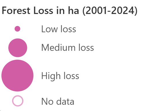
On top of the choropleth map, circles are displayed that show the amount of forest cover loss, with the size of the circle representing the amount of loss. Large circles indicate high levels of forest loss, while small circles indicate low levels.
Bivariate Map
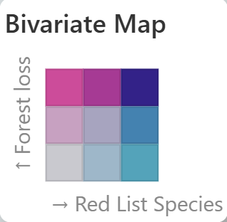
The bivariate map combines our two key variables: forest cover loss (per km2) in pink and species richness (of all red list species per km2) in blue. Where both values are high, the colors blend into purple, highlighting the areas where the biodiversity is most at risk due to significant forest loss and a high species richness in the same area. The values of both variables are normalized by country size.
Charts about countries
By clicking on a countries, different graphs and charts about the selected country appear on the right side of the map, that provide additional information about the forest loss and species richness.
Forest Loss Graph
The line graph shows the annual forest cover loss for the selected country between 2001 and 2024. The x-axis shows the years and the y-axis the amount of forest loss. Higher values indicate years with more intense deforestation or forest disturbance. This allows users to identify long-term trends, unusual peaks, and changes in forest loss over time.
Loss Drivers Chart
The donut chart illustrates the main drivers of forest loss in the selected country. Each segment represents the proportion caused by different factors such as logging, agriculture, wildfires, or infrastructure expansion. The chart helps users understand which human activities or natural disturbances contribute most to deforestation in that country.
Red List Species Chart
The chart about the red list species shows the total species richness of the selected country based on IUCN Red List data. The bars represent the number of recorded species within different animal groups, including birds, mammals, amphibians, and reptiles. By comparing the groups, users can better understand the country’s biodiversity composition and identify which species groups are most diverse.
Map Design
Design choices Red List Species Richness & Forest Loss Map
Red List Species Richness Map
A choropleth map was chosen to visualize species richness because it is well suited for showing the spatial distribution of a single variable across defined areas such as countries. By using color intensity with a sequential color scheme to represent values, it allows general patterns of species richness to be easily recognized and compared between regions. This type of color scheme is well suited for ordered data, as it communicates increasing intensity in a clear way (Christophe, 2019). Furthermore, this color scheme is color-blindness friendly and was created with the help of color brewer tool. In the map, species richness is displayed using relative values (number of species per area), which is important because countries differ greatly in size.
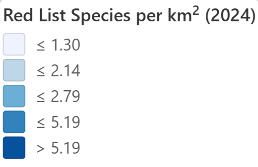
By using normalized data, we can make sure the map shows the species hotspots rather than just highlighting large countries, which would have been a difficulty of absolute data (Golebiowska et al., 2021). Another reason for choosing a choropleth map is that it is often used in media or educational context, so it is familiar to our target group (teenagers). Like this they already know how to read it and they should be able to quickly understand patterns.
Forest Loss Map
A proportional symbol map was chosen to represent forest loss because it allows quantitative differences between countries to be communicated clearly through symbol size. In this visualization, each country is represented by a pink circle, where larger circles indicate greater forest cover loss. According to cartographic design principles, size is one of the most effective visual variables for representing numerical data, as it enables users to quickly compare magnitudes between locations (White, 2017). Using proportional symbols also helps preserve the underlying geography, so the combination of proportional circles with the choropleth background of species richness makes it possible to compare both variables simultaneously while keeping them visually distinct.
Design choices Bivariate Map
A bivariate map was chosen because it allows two variables to be displayed within a single visualization, making it well suited to show the spatial relationship between forest loss and biodiversity. Compared to using two separate maps, this approach makes it easier to see where both variables have high or low values at the same time. This helps to quickly identify critical regions where the risk of biodiversity loss is particularly high, for example in countries with both high tree loss and high species richness. So combining the variables in one map reduces cognitive effort, as viewers do not have to mentally compare two separate visualizations, which can make it more difficult to recognize patterns and relationships accurately (Nelson, 2020).
The bivariate map consists of two combined sequential color schemes to represent forest loss and species richness at the same time. Like in the choropleth and raster maps, forest loss is shown in red tones, while species richness is represented in blue tones. Where both values are high, the colors blend into purple, highlighting areas where rich biodiversity overlaps with high forest loss. This color combination helps to clearly distinguish the two variables while also making their interaction well visible, while being suitable for colorblind people. By clicking on a country of interest on the bivariate map, a description of the bivariate class occurs on the right side of the map, helping to understand better what the different categories mean.
Design choices User Experience (UX) and User Interface (UI)
Justifiying Interactivity
Our overarching goal was to make our map and interface as intuitive as possible to ensure it was user-friendly for our target group of teenagers. The map was created using Shiny for Python. Shiny enables developers to create interactive dashboards and web applications with reactive elements. According to DiBiase (1990) web maps can be distinguished into a fluid continuum reaching from web GIS (exploration, highly interactive, flat visual hierarchy) to thematic web map (presentation, little or no interactivity, strong visual hierarchy). Given our topic and target audience, a high level of interactivity is desirable. Thus, providing interactive elements was important to us, so that users could play around with the map and explore different aspects. For interactive maps, the visual hierarchy of the map and its interactive elements should be relatively flat, this helps users to draw their own conclusions (Dent, 1990; MacEachren, 1995). We took this into account when developing our web application. It was important to us that this is an iterative process; we tested various color schemes and layouts for the interactive elements and have been continuously updating and improving the web map throughout the process.
Designing the User Experience (UX)
When interacting with an interactive map, users must engage their perceptual, motor, and cognitive skills as they view, edit, and interpret an interactive map. In our project, we decided to use the framework from Norman (1988) with seven observable stages of Interaction to build our user experience. The most important findings are summarized below (inspired by the compilation by Roth (2013):
1. Forming the Goal: Users may enter the website with the goal of understanding where biodiversity is most at risk due to forest loss. A student may want to identify which countries have high Red List species richness and also high forest loss. It could also be that they are given an assignment to look up the statistics for a particular country.
2. Forming the Intention: To achieve this goal, the user decides to compare countries with high forest loss and high species richness and investigate the main reasons behind these patterns. The user may drag across the map to the desired country or search for it using a search field.
3. Specifying an Action: The user can interact with the map by selecting the points-over-polygons view or the bivariate visualization mode. The user may click on a country to view detailed summary statistics and charts, such as forest loss over time, forest loss drivers, and the breakdown of threatened species. The time slider can be moved to compare different years and explore changes over time.
4. Executing an Action: The user moves the slider from 2001 to 2024, switches between map types, and clicks on Brazil or Indonesia to explore changes in forest loss and biodiversity indicators for highly affected countries.
5. Perceiving the System State: After interacting with the map, the user observes that the map colors, proportional symbols, and linked charts update dynamically to reflect the selected country and year.
6. Interpreting the System State: The user interprets that the proportional symbols change in size over time and notices that the charts and summary statistics update dynamically. The user also interprets dark purple areas on the bivariate map as regions where high species richness overlaps with high forest loss, indicating a potentially high risk of biodiversity decline.
7. Evaluating the Outcome: The user concludes that tropical rainforest regions such as the Amazon Basin and Southeast Asia are particularly vulnerable and gains a better understanding of the relationship between deforestation and biodiversity loss.
To support these interaction stages, the interface was designed with clear visual feedback, intuitive controls, interactive legends, and linked views between maps and charts. To further ensure that our design is as well-suited as possible to our target audience, we also conducted a user study (see the section “Userfeedback”).
Designing the User Interface (UI)
We tested various options for the user interface. Ultimately, we decided on a dashboard view that works well in Shiny. When the user scrolls to the map, there first is an informative window on how to get started working with the map. Even though users have a lot of freedom to explore different features, it makes sense to provide minimal directions. The placement of the interactive elements have been evaluated with the user study and updated in the progress. The Map title stayed constant in its position above the map as a page header. Firstly, the map came right after the map title. After the test, it became clear that it is better to place the controls at the top and aligned to the left, as that is where users are most likely to expect them to be.
The interactive elements contain firstly the “Select Layer” Burger Menu that works like a dropdown. The user can there change between the “Red List & Forest Loss” view and the “Bivariate Risk Map” View. For the “Red List & Forest Loss” Map, the user has the possibility to individually toggle on and off the two input layers “Red List Raster” and “Forest Loss Points”. This provides a high level of interface freedom to the user. Next to the Select Layer Option is the time slider. The interactive timeline allows users to explore the development of forest loss over the years between 2001 and 2024 and make comparisons between different years. It can be run automatically in given intervals by clicking on the “play” button or the user can grad the slider manually. The slider so far is only implemented for the “Red List & Forest Loss” Map. This is indicated to the user in the “Bivariate Risk Map” with the time scale being grayed out there and having a tooltip when hoovering over it informs with “not implemented yet”. The view for the slider is reloaded by default for each year in Shiny. This causes a rather unpleasant “flickering” effect when the animation is running. We are aware that this is not ideal. It would be possible to precompute these views outside of Shiny, but unfortunately, we lack the technical expertise to do so in the given time.
As next element right to the slider there is the option “Search country” which enables a user to search in words for a country of interest. Entering a country would result in: for the “Red List & Forest Loss” rendering the charts and summary statistics and for the “Bivariate Risk Map” showing the entity of the given country. This feature has not yet been implemented due to time constraints, which is also being shown to the user as being grayed out and having a tooltip when hoovering over it informs with “not implemented yet”. Below is the map, which covers 65% of the screen’s width and the interactive chart elements cover 35%. Here we’ve come up against a hurdle with Shiny, as this application doesn’t really allow for flexible display of content in the dashboard. It would be nice if, by default, only the map were displayed, and the charts appeared when the user clicks on a country. That way, the visual overload wouldn’t be as high. WE then tried out various versions of display. The final layout was chosen to ensure that the data is clearly legible while still allowing the charts on the right (more on that in a moment) to be easily readable as well. The initial zoom level of the map and the view were chosen so that all data points in the Forest Loss layer are visible by default. This makes sense, since this is a global application. The map consists of the actual map area with a light grey basemap. In it is the respective legend for both maps, the “Red List & Forest Loss” view and the “Bivariate Risk Map” view. The user can drag across the map interface using the mouse cursor and zoom in to get details (using the mouse or the on map zoom function). The purpose of our data is to enable global comparisons of the land areas of different countries. For this application, it is therefore important to use a projection that preserves area, a so called equal-area projection, e.g. Lambert Equal Area (Slocum et al., 2022). We wanted to implement it that way, but ran into a technical limitation of Shiny. Leaflet only has two CRS option: EPSG:4326 (official identifier of WGS 84) and EPSG:3857 (Web Mercator). Both of them are not equal-area projections and may produce misleading results because distortion changes with latitude. Unfortunately, we were limited by technical constraints here, so we weren't able to implement them properly, and we are aware of that.
On the right-hand side of the map area are the charts and summary statistics. When the user clicks one a chosen country, the map automatically zomms in on the given country the see the details more clearly. Hoovering over the charts provides detailed information. The charts adjust with the selected year in order to enable the user to compare between years. The “Forest Loss Graph” line chart is held in simple black for readability. The user can zoom in on certain time spans if wished. The “Loss Drivers Chart” uses colors according to Colorbrewer 7-Class Set1 and the “Red List Species Chart” utilizes ColorBrewer 4-Class Pastel1 palette for optimal visual distinction between the data. The interactive classification overview of the “Bivariate Risk Map” uses the same color scheme as the map itself (for the reasons explained earlier).
This together brings the interface scope to a total number of 8 interactive elements (Select Layer, time slider, country search, drag across the map with cursor and zoom, 3 interactive graphs for the “Red List & Forest Loss” view and the interactive classification panel for the “Bivariate Risk Map” view.
User Feedback
The web application was designed according to the core principles of geographic visualization and human-computer interaction. Following established models of cartographic communication (MacEachren, 1995) , the platform was built as a layered interactive map that guides users from basic visual decoding toward higher-level spatial reasoning.
The user feedback questions were designed to force active interaction with the platform, not just passive reading. Finding the correct answers required users to switch map layers, to realize that the needed information was not visible in the default view and had to be accessed through an alternative layer. This operationalizes the concept of hierarchical interactivity; users must actively explore the information system instead of consuming a static display. Successfully performing this layer switch was therefore used as an indicator of interface learnability
The second layer presented a bivariate map, encoding two data dimensions simultaneously and thereby increasing cognitive load. This map not only tests navigation skills but also the ability to correctly interpret more complex visual symbolization.
The Likert scales assessed interface clarity, target-group appropriateness, and the quality of the visualizations. Open-ended questions provided additional qualitative feedback on layout and text density. Both participants came from vocational training backgrounds with no prior knowledge of geography, which directly matches the platform's intended audience.
The user feedback evaluation used a questionnaire to test whether this communication chain works effectively for a non-expert audience (vocational trainees). Despite the small sample size (n=2), the qualitative feedback reveals clear usability patterns: the interactive map is consistently praised, while diagrams are invisible on mobile devices and text density is perceived as too high. These findings already allow concrete improvements.
Findings
Here we summarize 4 of the key findings of the project and discuss the spatial patterns we found between forest loss and biodiversity. This section also connects our findings to the Sustainable Development Goals, especially SDG 13 (Climate Action) and SDG 15 (Life on Land).
Tropical Rainforests have the highest Biodiversity
Tropical rainforest regions near the equator contain the highest richness of Red List species, making them some of the world's most important biodiversity hotspot.
Countries with a very high Risk of Biodiversity Loss
Countries in the Amazon region, parts of Southeast Asia and West Africa experience both high proportional forest loss and large numbers of endangered species, showing a high risk of biodiversity loss, through a strong connection between deforestation and biodiversity risk. In the year 2024 Brazil greatest Risk of Biodiversity loss.
Agriculture as the primary Driver for Forest Loss
Agriculture is the primary Driver for Forest Loss in most countries and most years. It regularly accounts for more then 30% of lost forest
Wildfires result in Forest Loss Peaks
Extreme wildfire events result in similar Forest loss to permanent agriculture, resulting in record peaks in forest loss.
Teaching Materials
Teaching material has been freshly planted and is still growing. A link to a forest of teaching materials will sprout here soon!
AI Statement
AI was used in this project as a supportive tool, for instance, for debugging, language improvement, and general assistance during development. AI-generated content, including code and text, was never adopted without review.
Sources
Literature
Betts, M.G. u. a. (2017) „Global forest loss disproportionately erodes biodiversity in intact landscapes“,
Nature, 547(7664), S. 441–444. DOI: https://doi.org/10.1038/nature23285.
Di Biase, D. (1990). Visualization in the Earth Sciences. Earth and Mineral Sciences, Bulletin of the College of Earth and Mineral Sciences, Pennsylvania State University, 59, 13-18.
Dent, B. D. (1990). Cartography: Thematic Map Design. 2nd Edition. Dubuque, IA: W.C. Brown.
Christophe, S. (2019). Color Theory. The Geographic Information Science & Technology Body of Knowledge (1st Quarter 2019 Edition), John P. Wilson (Ed.).
DOI: https://doi.org/10.22224/gistbok/2019.1.9
Feurer, M. u. a. (2025) „Drivers of deforestation and forest degradation between 1990 and 2023 - A global meta-analysis“, Environmental Science & Policy,
173, S. 104242. Verfügbar unter: https://doi.org/10.1016/j.envsci.2025.104242.
Global Forest Watch (2014) Interactive World Forest Map & Tree Cover Change Data |
GFW. Available at: https://www.globalforestwatch.org/map/
Golebiowska, I., Korycka-Skorupa, J., and Slomska-Przech, K. (2021). Common Thematic Map Types. The Geographic Information Science & Technology Body of Knowledge (2nd Quarter 2021 Edition), John P. Wilson (ed.).
DOI: https://doi.org/10.22224/gistbok/2021.2.7
IPBES (2019) Global assessment report on biodiversity and ecosystem services of the Intergovernmental Science-Policy Platform on Biodiversity and Ecosystem Services. Herausgegeben von
E. Brondizio u. a. Zenodo. DOI: https://doi.org/10.5281/ZENODO.6417333.
MacEachren, A. M. (1994). Visualization in Modern Cartography: Setting the Agenda. In: A. M. MacEachren & D. R. F. Taylor (Eds.), Visualization in Modern Cartography (pp. 1-12). Oxford, England: Pergamon.
MacEachren, A. M. (1995). How maps work: Representation, Visualization & Design.
Nelson, J. (2020). Multivariate Mapping. The Geographic Information Science & Technology Body of Knowledge (1st Quarter 2020 Edition), John P. Wilson (ed.).
DOI: https://doi.org/10.22224/gistbok/2020.1.5
Nielsen, J., & D. Norman. (1998-2017). The Nielsen Norman Group: Evidence-based user experience research, training, and consulting. Retrieved from: https://www.nngroup.com/
Norman, D. A. (2013). The Design of Everyday Things: Revised and Expanded Edition. New York: Basic Books.
Roth, R. E. (2013). An Empirically-Derived Taxonomy of Interaction Primitives for Interactive Cartography and Geovisualization. IEEE Transactions on Visualization and Computer Graphics, vol. 19, no. 12, pp. 2356-2365,
The IUCN Red List (2024) The IUCN Red List of Threatened Species, IUCN Red List of Threatened Species.
Available at: https://www.iucnredlist.org/en (Accessed: 12. Mai 2026).
United Nations (ohne Datum) THE 17 GOALS | Sustainable Development. Available at: https://sdgs.un.org/goals (Accessed: 12. Mai 2026).
White, T. (2017). Symbolization and the Visual Variables. The Geographic Information Science & Technology Body of Knowledge (2nd Quarter 2017 Edition), John P. Wilson (ed.).
DOI: https://doi.org/10.22224/gistbok/2017.2.3
Pictures
Picture Rainforest intact:
https://unsplash.com/photos/green-trees-on-mountain-under-white-clouds-during-daytime-FibHpAWUqfw?utm_source=unsplash&utm_medium=referral&utm_content=creditCopyText
Picture Rainforest destroyed:
https://unsplash.com/photos/green-grass-field-and-mountains-under-blue-sky-during-daytime-_iyh6g5KHQA
Picture SDG13 Logo:
https://www.un.org/en/file/60463
Picture SDG15 Logo:
https://commons.wikimedia.org/wiki/File:Sustainable_Development_Goal_15.png
Logo IUCN Red List:
https://www.discoveranimals.co.uk/news/meet-7-new-endangered-species-added-iucn-red-list/attachment/iucn-red-list-logo-red/
Logo Global Forest Watch:
https://www.globalforestwatch.org/
Contact
Group 4, Department of Geography, University of Zurich