INTRODUCTION & MOTIVATION
Why this research matters...
Police-reported multi-party cyclist accidents in the City of Zürich
light, severe and fatal injury cases · excluding self-accidents 2011–2025
0
traffic accidents involving at least one cyclist
Urban transportation is constantly adapting and transforming as cities seek to balance increasing travel demand with environmental sustainability and road safety. In many urban areas, population growth and expanding mobility needs place significant pressure on existing transport infrastructure (Ceder, 2020), intensifying competition for limited road space among different users. These challenges are particularly relevant in cities such as Zürich, where transportation systems must accommodate pedestrians, cyclists, public transport, and motorized vehicles within a dense urban environment (Menendez & Ambühl, 2022).
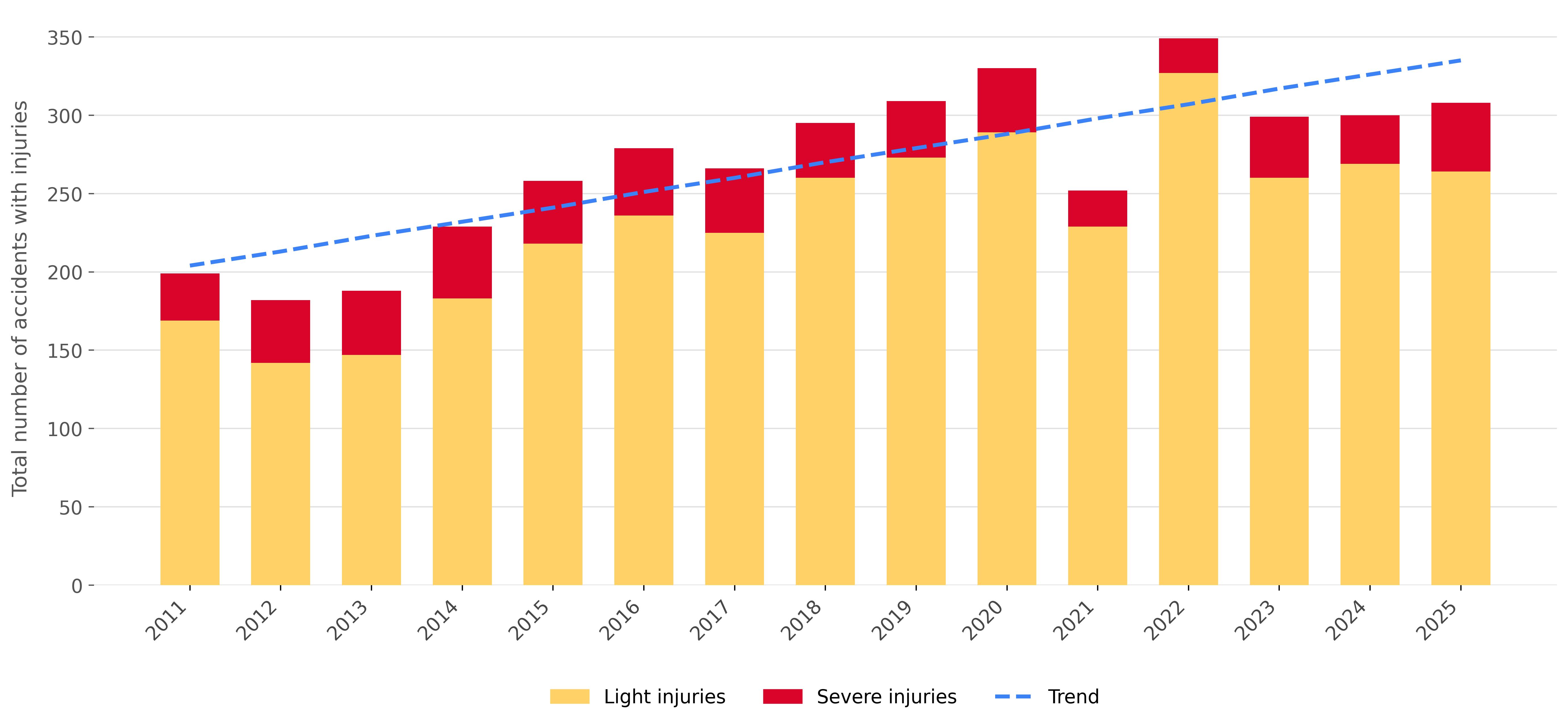
The city of Zürich has the most bicycle accidents than any other city in Switzerland (City of Zürich, 2026). Since 2011, there has been a steady increase in bicycle accidents and thus there is a great need for action, because, in principle, every accident is one too many. With this in mind, we wish to investigate cycling accidents and identify both spatial and temporal hotspots. Ultimately, this should enable policymakers, authorities, and other stakeholders to take these patterns into account in their urban planning considerations and ensure greater road safety. In doing so, we intend to focus our research on non-motorized transport. We regard this as a sustainable, environmentally friendly, and space-efficient mode of transport that should be expanded in the future.
Cycling plays a key role in sustainable urban mobility. Cities worldwide are increasingly promoting human-powered transportation, such as walking and cycling, as part of broader strategies to reduce congestion, emissions, and environmental impacts associated with private car use (Menendez & Ambühl, 2022). Transport systems that prioritize these modes can help reduce the ecological and spatial footprint of mobility while maintaining efficient movement of people through the city (Mavlutova et al., 2023). However, as cycling activity increases, understanding the risks faced by cyclists becomes essential for ensuring that infrastructure and policies support safe travel for all road users.
Research has shown that bicycle crashes can be influenced by a range of environmental, infrastructural, and behavioral factors (Orsi et al., 2017; Mavlutova et al., 2023). For example, studies indicate that conditions such as poor lighting significantly increase the probability of severe cycling injuries, highlighting the importance of infrastructure design and safety measures in reducing accident severity (Dash et al., 2022). Furthermore, bicycle crashes frequently occur not only at intersections (Loidl et al., 2016) but also along road segments, suggesting that risk is distributed across multiple parts of the urban road network (Dash et al., 2022). Identifying where and when such risks are concentrated can therefore provide valuable insights for targeted safety interventions.
Within this context, spatial analysis offers a powerful tool for improving cycling safety. By mapping and analyzing bicycle accidents, it becomes possible to identify patterns, hotspots, and temporal trends. These insights can support evidence-based decision-making for urban planners, transport authorities, and policymakers seeking to improve cycling infrastructure and reduce accident risks.
Ultimately, improving cycling safety is not only a matter of reducing accidents but also of supporting the broader transition toward sustainable mobility. By understanding where and why cycling accidents occur, cities like Zürich can design transport systems that encourage cycling while ensuring that it remains a safe and attractive option for everyday travel.
This project focusses on the following Sustainable Development Goal (SDG):
SDG11 - Sustainable Cities and Communities which aims to make cities inclusive, safe, resilient, and sustainable.
The website will pay specific attention towards promoting a safe and
sustainable transport system for all in the city of Zurich.
METHODS
How the analysis was conducted
Data Cleaning
The initial inspection of the raw data was performed in QGIS.
Only accidents involving multiple persons were included in the analysis, and all selected
cases include at least one cyclist. In addition, categories with only a single recorded
person were excluded to improve the robustness of the spatial analysis and reduce noise
from potentially isolated events. Accidents involving property damage only were also removed, ensuring
the focus remains on human injury–related road safety outcomes involving cyclists.
Spatial Analysis
Clustering Aggregation of accident points:
The accident locations were aggregated using a fixed-grid binning approach.
We chose this method over more advanced cluster algorithms because the grid remains
spatially constant over time, enabling direct comparison of accident trends within the
same geographic areas.
The points need to be in Swiss projected coordinate system CH1903+/LV95 (EPSG:2056) to
allow metric calculations. We took a simple approach by just dividing the swiss metric
coordinates through the grid size (50m, 150m or 300m). Accidents falling into the same grid cell
are grouped together and the mean spatial center of the points are calculated for the cluster coodinate.
This means that the cluster marker is dynamically positioned at the mean location of the accidents
within the grid cell.
Coordinate Transformation:
The raw dataset and city boundary have the Swiss projected coordinate system CH1903+/LV95 (EPSG:2056),
which is perfect for metric grid calculations. Because web maps require geographic coordinates, we had
to reproject the spatial data at the end into WGS84 (EPSG:4326) to plot it correctly on the map.
Attribute based grouping:
After grid binning, the dataset is aggregated. For each spatial cell, descriptive statistics
are calculated. These include the total accident count, the involvement of specific road users
and accident types.
Calculation of Severity Ratio:
To evaluate the spatial risk level, a custom metric called the Severity Ratio is computed for
each grid cell. It is defined as:
(accidents with severe injury + accidents with fatalities) / (total number of accidents including injuries or fatalities)
The ratio describes the proportion of severe injury accidents within a grid cell relative to all
recorded accidents involving injuries. Fatalities were included in the severe category, as 'only' 22
fatal accidents were recorded during the 2011–2025 period. This approach enables a more
robust spatial comparison of accident severity across clusters independently of overall accident
frequency.
Reverse geocoding:
The Top 5 hotspots were reverse geocoded to street names using the OpenStreetMap Nominatim API
based on their latitude and longitude coordinates. Since the accident dataset only contains spatial
coordinates and no street information, reverse geocoding was applied
to provide a more interpretable location description for the most significant accident clusters.
To comply with the API's usage policies a strict rate limit of one request per second is
enforced using a 1-second delay (Sys.sleep(1)) between requests. This rate limiting also explains
the loading time when updating the page, for example after selecting a new time range.
Originally we planned to geocode every cluster, but due to computational and API constraints we had to reject this idea.
Map Visualization
All the design choices were made with the user in mind. The target users of this map are
policymakers and urban city planners. It is likely that the target users do not know what
they want when they first interact with the map, thus it is important for us to adequately
display the information they need in comprehensible ways (Roth et al., 2015). To guarantee
the user does not get confused in the website, the tabs leading to different sections of the
website are always available. This improves the websites functionality
(Nivala et al., 2008).
The interactive map was built as an R Shiny application using the Leaflet library and is
embedded in the website via an iframe.
Below you can find more information on the design choices for the respective elements of the map.
▶ Basemap
Initial zoom: The initial display of the map sets the zoom to the entire
city of Zürich with its boundary, the data shown is from 2023-2025 and the grid size for the aggregation is
set at 150m. This is the default display of the map since Zürich is the area of interest
and recent data are often times more relevant. Moreover, there is no plus and minus symobol
indicating zoom since our map is for professionals who should be familiar with the zoom features
of maps such as the mouse-wheel zooming (Resch & Zimmer, 2013).
Color of the base map: To prevent overstimulation in the user when
using the map and after feedback, a dark CartoDB Positron base map was chosen. This helps
to be able to differentiate the lightest yellow circles from the background. This also
allows for the color scheme chosen for the accidents to stand out further. Additoinally, since the basemap is dark,
the outline of Zürich is set to a light color so that it is clear to the user where the city is.
Coordinate Reference System: The original dataset and city boundary were stored
in the Swiss national projected coordinate system CH1903+/LV95 (EPSG:2056). This was suitable for the spatial analysis
and clustering, however, WGS84 (EPSG:4326) was required for the web mapping of the data since it preserves geographic location.
Additionally, it ensured that the data points had the same latitude and longitude coordinates as the map so that the
visualisation was correct (MacEachren, 1998).
▶ Legend
A messy, overwhelming map deters users and makes the user experience less pleasant
(Nivala et al., 2008), and that is why the map only has the legend displayed automatically.
The pop-ups and the full legend are only expanded upon the user's selection.
Time scale: The time scale is available to accommodate different users goals.
For long-term understanding of the bicycle accidents in Zürich, the user can select the entire
dataset or their specified time range. Additionally, if the user is only concerned with recent
data and how to mitigate the accidents that occurred then, then they can select a single year
(i.e. 2025).
Total Accident Numbers in Zürich Graph (2011-2025): This graph shows the user
the general trend of bicycle accidents in Zürich. When a time period is specified the bars in the graph
that match the time period are coloured in yellow and red to display the number of light and severe
accidents. The inclusion of the linear trend line is reminder to the user that the bicycle accidents
are increasing, so as they make their observations that information can remain in the forefront.
Data Filters: The users has the ability to decide what they would like the data
displayed on the map, either by the number of accidents or by the severity of accidents. The default
setting is "No Filter", so the clusters are ont highlighting any specific attribute. When the data
is filtered by the number of accidents, the user can select the minimum number of accidents that should
be displayed. When the selection is made a pop-up is shown below in yellow informing the user of the number
of accident clusters displayed due to the filtering. Simlarly, when the data is filtered by the severity
of accidents, the user can select the minimum percentage of severe accidents that should be displayed.
When the selection is made a pop-up is shown below in yellow informing the user of the number of accident
clusters displayed due to the filtering.
Top 5 Accident display: The user has the ability to see the top five accident
locations depending on the time frame they select. This element ensures utility which is the
usefulness of an interface for completing the user's desired set of objectives
(Roth et al., 2015). The objective of the website is to locate high bicycle accident areas.
With the reverse geo-coding that allows for the inclusion of the street address in the table,
the user can investigate further as to why there are so many accidents in that area. Furthermore,
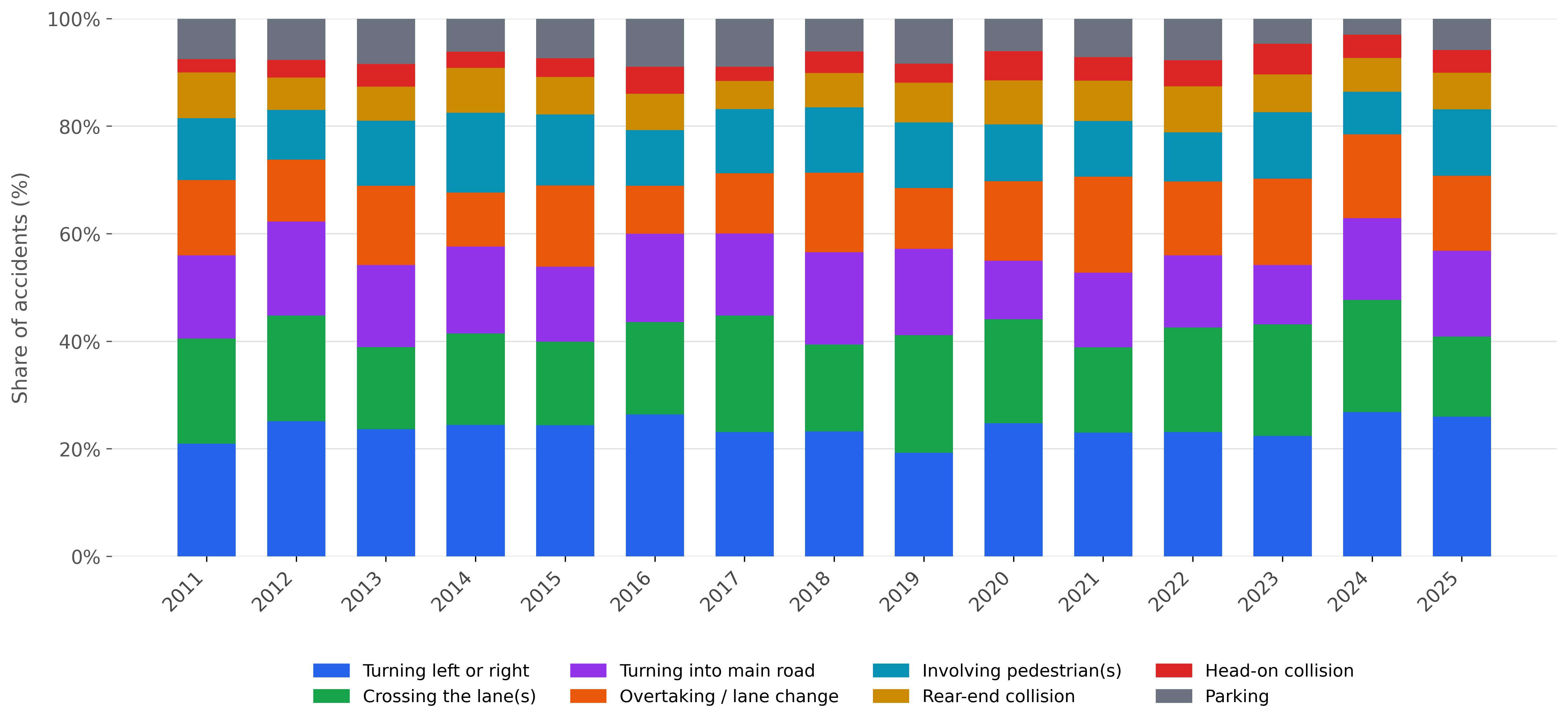
the pop-ups shown on the map when a point is selected show the user the total number of accidents,
the severity, the road users involved and since the data was aggregated it also includes a bar graph
displaying the percentage of all accident types in the location.
Advanced Display Options: Users have the option to change the grid size to which
the raw data points are aggregated to. The options are 50m, 150m, 300m. This feature was offered to accomodate
any uses for the map. A higher resolution of 50m would allow the user to identify accident hotspots at a
smaller scale whereas a lower resolution of 300m gives the user a larger overview of accident hotspots. Addtionally,
the user has the ability ot display the raw data points on the map. They are displayed as a light grey color for light injuries
and a light grey-red for severe injuries which was deemed appropriate when considering colorblindness
and overall visuals of the map. This provides the user the spatial distribution of the accidents along the streets Zürich.
▶ Symbology
Colour: Circle colour symbolises the severity ratio, defined as the proportion of
severe and fatal accidents relative to all injury accidents within the cluster.
This ratio is classified into five equal intervals, this allows users to
immediately assign a cluster to a meaningful severity category. The color hue was selected with colorblindness
taken into consideration. The colors yellow, orange, and red represent low, medium, and high accidents, respectively
(White, 2017). For the visual display to make sense to the user, the hues were selected in a logical
order. The colour of the data has great influence on where the viewers look first on a map and what
they search for (Wolfe & Horowitz, 2004). The color value decreases as the number of accidents in a
location decreases.
Size: The size of the circles increases as the number of accidents in the aggregated
area increases. The radius of the circle is scaled as the square root of the total accident count,
multiplied by a factor of three. The square root is necessary to prevent large clusters appear disproportionately dominant.
This choice was made because size is an effective visual variable (White, 2017). Size
undoubtedly guides the attention of the user (Wolfe & Horowitz, 2004; Garlandini & Fabrikant, 2009) and that is why
it is implemented in the map.
Shape: Because the data used is numerically quantitative, the shape of the
symbols will not severely impact the understanding of the data in the map. Circles were
chosen as a default however; users will intuitively know that it represents the accidents
in the area and as you zoom in it gets to a more specific location.
Pop-ups: To ensure the best experience for the users, information pop-ups and
instruction pop-ups were included in the map to increase usability (Roth et al., 2015).
The instruction pop-ups help with learnability and efficiency (Roth et al., 2015). The smallcase i
is a universal symbol for information, therefore the users should have easy access to that feature
in the map. For each element in the legend the user can find out how that element changes the map
and how it helps them achieve their aim. The information pop-up's for the accidents give the user the following information:
the total number of accidents, the number of severe and light injuries, the road users involved, what the road user
was doing when teh accident occurred, the accident occurences in that cluster over time in a graphical format. The
information pop-up for a raw data point displays the following information: the year, the day and time of the accident,
the severity and what the road users were doing when the accident occurred.
A limitation in the data displayed is that when the user changes the time period, data filters, or the grid size,
it can be computationally heavy for RShiny. So, as the data loads there is a loading pop-up to show the user
that the software is running, it just needs some time.
References:
Used literature
Ceder, A., 2021. Urban mobility and public transport: future perspectives and review. International Journal of Urban Sciences, 25(4), pp.455-479.
Garlandini, S. and Fabrikant, S.I., 2009, September. Evaluating the effectiveness and efficiency of visual variables for geographic information visualization. In International conference on spatial information theory (pp. 195-211). Berlin, Heidelberg: Springer Berlin Heidelberg.
Loidl, M., Wallentin, G., Wendel, R. and Zagel, B., 2016. Mapping bicycle crash risk patterns on the local scale. Safety, 2(3), p.17.
MacEachren, A. M. (1998). Cartography, GIS and the World Wide Web. Progress in Human Geography, 22(4), 575–585. https://doi.org/10.1191/030913298670626440
Mavlutova, I.; Atstaja, D.; Grasis, J.; Kuzmina, J.; Uvarova, I.; Roga, D. Urban Transportation Concept and Sustainable Urban Mobility in Smart Cities: A Review. Energies 2023, 16, 3585. https://doi.org/10.3390/en16083585
Menendez, M. and Ambühl, L., 2022. Implementing design and operational measures for sustainable mobility: Lessons from Zurich. Sustainability, 14(2), p.625.
Nivala, A.M., Brewster, S. and Sarjakoski, T.L., 2008. Usability evaluation of web mapping sites. The Cartographic Journal, 45(2), pp.129-138.
Orsi, C., Montomoli, C., Otte, D. and Morandi, A., 2017. Road accidents involving bicycles: configurations and injuries. International journal of injury control and safety promotion, 24(4), pp.534-543.
Resch, B., & Zimmer, B. (2013). User Experience Design in Professional Map-Based Geo-Portals. ISPRS International Journal of Geo-Information, 2(4), 1015–1037. https://doi.org/10.3390/ijgi2041015
Roth, R.E., Ross, K.S. and MacEachren, A.M., 2015. User-centered design for interactive maps: A case study in crime analysis. ISPRS International Journal of Geo-Information, 4(1), pp.262-301.
Stadt Zürich, 2026. Police-recorded traffic accidents in the city of Zurich since 2011. Available at: stadt-zuerich.ch (Accessed: 6 May 2026)
White, T., 2017. Symbolization and the visual variables. Geographic Information Science & Technology Body of Knowledge, 2.
Wolfe, J.M. and Horowitz, T.S., 2004. What attributes guide the deployment of visual attention and how do they do it?. Nature reviews neuroscience, 5(6), pp.495-501.
AI Statement:
AI-powered tools (Chat GPT and Claude) were used to assist with website optimization and code debugging, as well as for linguistic editing and correcting grammar.
We confirm that we have checked the accuracy of the AI-generated content to the best of our knowledge and
beliefs, and we declare that we personally take the full responsibility for this human-machine collaboration
outcome.