 Picture Source
Deforestation & Poverty
What is the relationship between poverty and deforestation in rainforest-containing countries in Sub-Saharan Africa?
Go directly to Map
Picture Source
What is the relationship between poverty and deforestation in rainforest-containing countries in Sub-Saharan Africa?
Go directly to MapThe relationship between poverty and deforestation, particularly in tropical regions, has been a topic of research for many years. General consensus seems to be that such a relationship exists, but what exactly its nature is, or which policies may be most appropriate to tackle deforestation, is a subject of ongoing debate. In this project, we would like to visualize this controversial relationship and explore whether, and where, we can find correlations or connections that may shed light on the strength of association between poverty and deforestation. Gaining a more detailed understanding of the interplay between deforestation and poverty would serve to create policy measures capable of alleviating both issues effectively. For this purpose, we have found highly resolved data for poverty in the tropical regions of Africa. This, in combination with deforestation data on a country-scale, will allow us and the users of our web map to visually examine the relationship between deforestation and poverty, and find answers to our research questions.
The project explores how poverty contributes to deforestation, supporting efforts to design poverty alleviation strategies that also protect natural resources.
By highlighting spatial patterns of resource use and forest loss, the project encourages more sustainable and equitable land-use, production practices and consumption.
The project helps identify where forest ecosystems are most threatened by poverty-related pressures, aiding targeted conservation and land restoration efforts.
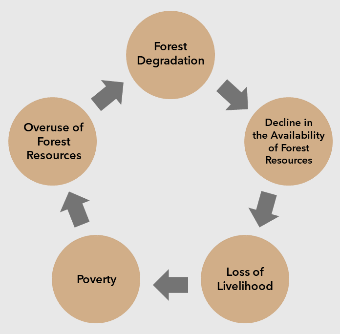
Figure 1: Deforestation and Poverty cycle after Meher (2022).
Poverty, in its broadest definition, has been shown to underly deforestation activities in various studies. Meher (2022) uses the following diagram (see Fig. 1) to visualize the hypothesized circular links between the two variables. From this figure, it becomes apparent that poverty is not only seen as a cause, but a potential effect of deforestation, thereby creating a “downward spiral” phenomenon – forest degradation results in poverty, which results in more deforestation. However, this general assumption has been criticized by many as too simplistic.
For example, Geist & Lambin (2003), derive various, more specific causes for deforestation from surveys, such as resource-poor farming, survival economies, displacement, landlessness, joblessness, and marginalisation. Many of these factors may form part of or correlate with poverty, however, it is important to consider that a simple “lack of money” may not explain the complexities underlying deforestation well enough.
In a study comparing deforestation and poverty in Indonesia and Malaysia, Miyamoto (2020) found that generally, poverty does seem to lead to deforestation when agricultural rent is high and there are sufficient forests. Pfaff et al. (2008) report similar findings, stating that poverty is often linked to access to only poor-quality land with low returns, which may result in the need for more agricultural land to earn a living, and therefore to more deforestation.
Examining whether deforestation in turn also increases poverty, Miyamoto (2020) concluded that this depended on the profitability of the land. She found that, in Indonesia, converting forest into rubber plantations did not yield enough income for people to escape poverty. Furthermore, she determined that poverty reduction, as it was undertaken by means of various policies in Malaysia, did lead to a reduction in deforestation. She therefore stresses that moratoria on deforestation cannot be sustainable without financial assistance for economic loss.
Both her and Hübler (2017) highlight the need for diverse poverty reduction strategies to combat deforestation, which could include efforts to improve education or medical support. Looking at Geist & Lambin’s list of causes, their findings seem to suggest a similar, holistic approach to the alleviation of social issues, which would ultimately also decrease deforestation rates.
Of course, this is not easily implemented. For successful policies, governments need to localize crucial areas and quantify the effects of poverty and deforestation in some way. Miyamoto thus stresses the importance of small-scale poverty data, which is hard to obtain due to the expense of household surveys. In our project, we use small-scale poverty estimates instead – an approach that could be implemented by policymakers as well.
Finding high-resolution poverty data covering multiple tropical countries was difficult. As Lee & Braithwaite (2022) note, household surveys, which produce such data, are expensive and difficult to obtain. For our project, we thus decided to rely on village-level poverty maps created by Lee & Braithwaite’s prediction methodology, with a resolution of 1.6km x 1.6km (1 square mile) for Sub-Saharan African countries. Lee & Braithwaite used various available data sources and machine learning techniques to create this data. Amongst the data sources are:
The authors used XGBoost (eXtreme Gradient Boosting) as a machine learning algorithm. They subsequently trained a convolutional neural network (CNN) model on the day-time satellite images, using the predicted wealth indices from the machine learning algorithm. Validation of their results showed an average R-squared value of 87% between the estimated wealth index produced by their model and the wealth index reported by the DHS.
The resulting data is therefore derived from many different data sources which vary in quality and resolution. This, combined with the choice of algorithm and algorithm parameters, the quality of the DHS data, and the assumptions underlying the authors’ definition of poverty, results in data which reflects a potentially biased estimate, rather than fact. Despite these limitations, we determined this data source to be the most suitable for our project. Not only was it the only source of such detailed poverty data for such a large region, it also provided very recent and well-documented data, and its validation techniques and results were indicative of a well-planned, meticulous research process. Furthermore, as we are interested in finding relationships between deforestation and poverty (rather than make statements about absolute poverty levels), we assumed sound poverty estimates to be sufficiently accurate for our purposes.
Deforestation data was retrieved from Global Forest Watch Open Data Portal. This data is based on time-series analyses from Landsat imagery. The data contained in the dataset named “lossyear” is described as follows:
“Forest loss during the period 2000-2022, defined as a stand-replacement disturbance, or a change from a forest to non-forest state. Encoded as either 0 (no loss) or else a value in the range 1-20, representing loss detected primarily in the year 2001-2022, respectively.”
The data has a spatial resolution of 1 arc-second per pixel, which corresponds to about 30m at the equator. All relevant data tiles (each covering 10 x 10 degrees) were downloaded directly as TIF files.
We chose this data source due to its high spatial resolution, and its temporal accordance with the poverty data (which is dated 2022, just as the deforestation data covers the period from 2000-2022).
Already in our original map sketch, we designed our map interface to be as intuitive as possible whilst still providing as much information as necessary. The map draws the main focus, but is surrounded by explanatory statistics, which should help the user to gain a better, more quantitative insight into what can be seen on the map. Exploring the development of deforestation over the years using the interactive timeline will hopefully transmit the urgency of the situation to the user, and inspire them to explore the topic further. Finally, the user can also interact with the map by clicking on any country and obtaining country-specific statistics on deforestation trends.
Certain things have been adapted from this first sketch – most notably, we decided to exclude the histogram of the IWI, as it may have been more difficult to interpret, and didn’t fit in our layout the way we had planned – rather, we wanted to keep the map simpler, and display the two deforestation trend lines together to be easily comparable.
From the basemaps available for public use via RShiny, we decided on a simplistic, greyscale basemap that would provide the necessary geographic context without distracting from the information displayed on the map. To interpret our map, the user does not need any terrain information, nor the location of roads and buildings. Simply displaying the country names and their outlines allows the user to position themselves geographically and focus on the interpretation of the data (Dumpor & Midtbø, 2017).
At the initial zoom level and map extent, the user is shown all Sub-Saharan countries for which we display data at close range, yet is still able to recognize the shape of the African continent and thereby understand where they find themselves. Using the traditional +/- buttons in the top left corner, the user can now adjust the zoom level as they please. As Harrower & Sheesley (2005) note: “there is no single best way to implement […] zooming functionality in maps since it depends upon the user”. However, they stress that commonly encountered zoom designs will often feel the most natural to users and therefore facilitate their map interpretation. As our zoom design mirrors that of Google Maps, we believe most users will be familiar with its functionality and therefore be able to use it intuitively. Additionally, scrolling on the mousepad also zooms in / out of the map, as is the case with Google Maps as well. A home-button right underneath the zoom buttons facilitates the return to the initial zoom settings.
We chose the WGS84 as our coordinate system for several reasons. Whilst our data only covers Sub-Saharan Africa, we still wanted users to be able to zoom out for a view of the entire world, as some may not be familiar with the map extent shown. Therefore, a local coordinate system would be ill-suited. Moreover, our data covers a rather large area, further requiring the use of a global coordinate system. Much as described in the zoom chapter, the main advantage of the WGS84 in this case is its ubiquity in our daily lives. Users will be familiar with it and will not have to spend time adapting to a new perspective. Furthermore, to interpret this map, exact areas or distances are not needed – therefore, the WGS84 fulfils our requirements. Lastly, for areas around the equator the WGS84 is the most accurate, allowing for precise depictions of our main study area.
For the deforestation map layer, we decided on a light yellow to brown colour scheme, as we believed these colours would easily call the association to deforested (potentially agricultural or barren) land. This assumption is shared by Green & and Horbach (1998), who describe «paucity of vegetation» as one of the connotative meanings of yellow colour tones.
In order to make sure that the map layer colours differed sufficiently from another even when accounting for colour blindness, we decided against a dark red to white colour scheme for the poverty layer, as the darker red could be difficult to distinguish from the brown tones of the deforestation map. Instead, we chose a purple colour ramp for this layer. Purple has often been used to raise awareness for homelessness and hunger, both phenomena related to poverty. We are aware that the opposite is also true – purple has been used to signify wealth or nobility in some cultures. However, Jonauskaite et al. (2020) concluded from an in-depth study, that purple, of all colours, was the one most ambiguously associated with various emotions or connotations. It is therefore less likely to be as deeply associated with either phenomenon in our users as for example green is with nature. Furthermore, as darkness in visualizations has negative connotations, and is often used to signify greater attribute values (“dark-is-more-bias”) (Schiewe, 2024), we assume that having dark shades of purple signify more poverty and light shades signify less poverty, will in most cases not be counter-intuitive to interpret. By labelling our legend with “severe poverty” and “moderate poverty” (rather than low Wealth Index, high Wealth Index), we hope to eradicate any possible confusion.
Furthermore, we chose a colour ramp ranging from very dark purple (high poverty levels) to a light purple (lower poverty levels) rather than to white, for two reasons. First, white was not clearly distinguishable from the background. Second, extending the colour ramp all the way to white could have given the impression that low levels (white areas) show the absence of poverty, when in reality, the absence of data represents the absence of poverty.
For the country-specific data in the pop-up area, we chose to display the deforestation trend over time for the country chosen by the user. This allows for a comparison between the deforestation trend across all countries and the deforestation trend within the country of interest, thereby creating an understanding of local developments in the regional context. For both graphics showing deforestation trends (both across all countries and country-specific), we chose a line graph, as Zacks & Tversky (1999) found that users intuitively perceive data displayed by line graphs as trends. We also observed that in official or scientific statistics, such as data displayed on “Our World in Data”, line graphs are used to connect yearly data points of tree cover loss (see, for example, this article).
The advantage of temporal animations in maps over static maps is that they are able to “reveal patterns or relations which would not be clear by looking at static maps” (Kraak et al., 2002). For our project, we want to allow users to explore trends in our data in whichever way suits them most – therefore, providing a timeline animation was important to us. The timeline animation can be started and stopped using the traditional pause/play buttons. The legend for the animation is a slide bar, which is suitable for depicting linear time (Kraak et al., 2002). However, to give the user complete control over their interactions with the data, it is also possible for them to click on single dates (years) to display that specific data. The animation acts only as a companion visual tool to more easily evaluate trends over time.
When clicking on a country to display the specific statistics, the country selected is shown with a bold, yellow outline on the map. For better understanding of the timeline, the country-specific line graph appears yellow, with the specific data point which the animation is currently displaying shown in black.
We decided against popups within the map showing the exact numbers contained in the map layer for that country. Especially for the poverty layer, having those values show up would likely not help, but rather confuse the user, as the poverty scale is not intuitive to interpret: what is a poverty value of 4? How does it relate to a poverty value of 8? Since our values are derived from a rather complex model by Lee & Braithewaite (2022), these questions are difficult to answer concisely. Therefore, labelling our scale with relative terms (severe / moderate poverty) makes more sense than using the actual numbers. Since the scale is relative, no exact numbers are needed for the interpretation – the user observes spatial trends rather than local statistics.
To display our data optimally on a map, we first had to complete several steps. All of these were carried out in RStudio.
We wanted to visualize the deforestation data as a choropleth map, since we had only one value per country for each year – so using a choropleth map was the most suitable choice. However, because the countries in tropical Africa vary greatly in size, we first had to normalize the deforestation data to allow for a direct comparison between countries. In addition to the yearly deforestation data per country, the Global Forest Watch website also provides the tree cover area per year and per country. This allowed us to easily normalize the deforestation data by calculating the ratio of deforestation to tree cover area for each country and year. To better show the effect of deforestation, we decided to use cumulative values. This means we added up the normalized values year by year – so the value for a specific year includes the sum of all previous years plus the value for the current year. Next, we downloaded the country polygons for each of our selected countries, merged them, and added the cumulative, normalized deforestation data through a join. In the end, we had one polygon per country with attributes for each year from 2001 to 2023 and a corresponding deforestation or tree cover loss value.
The Wealth Index was originally available as a point dataset, meaning there was one value for each pair of coordinates. However, since we didn’t want to show point data but rather a continuous surface, we interpolated it. This was necessary because the Wealth Index is mainly collected in settlements, while we wanted to show the correlation between deforestation and poverty.
As the main deforestation areas do not exactly match the villages or towns where the index was collected, we performed an interpolation so we could also have a Wealth Index value in each deforestation area. We chose inverse distance weighting (IDW) as the interpolation method. The resulting continuous raster surface was then clipped to the polygon shapes of our countries, so that both datasets would match correctly on the map. Since the Wealth Index represents also “wealth” – that is, a continuous scale from 0 (= very poor) to 100 (= very wealthy) – we filtered out all high values, as we only wanted to show poverty or a poverty index. The paper states that the lower third of the data indicates moderate to severe poverty. For this reason, we also used the lowest 33% of the data and removed everything above that. This corresponds to Wealth Index values up to around 16. In the end, we were left with only those areas that actually indicate poverty.
Finally, both datasets were projected to the same coordinate system to ensure they were displayed correctly and consistently on the map.
Immediately visible from the regional trendline is that deforestation rates were lowest before 2010, highest in the early and late 2010s, and have decreased very slightly in the 2020s (the trendline flattens somewhat). The animation shows that rates were continuously highest in the North-Western part of our study area (Guinea-Bissau, Guinea, Liberia, Ivory Coast, Ghana and Sierra Leone). Conversely, the cumulative normalized tree cover loss remained lowest in Gabon and the Central African Republic.
As for poverty, at first glance it becomes apparent that a large fraction of our study area seems to experience high levels of poverty. Sierra Leone, the Democratic Republic of Congo, and Gabon are likely amongst the countries in which most of the country’s area is classified as poverty-experiencing. Clusters of very dark purple shades can also be found in Angola and Zambia. In our map, Ghana, Benin and Guinea show the lowest prevalence of poverty.
From our map it also becomes obvious that no universally accurate connection can be drawn between deforestation and poverty. For example, while the Central African Republic experiences extremely high poverty, it has one of the lowest deforestation trends in our study area. On the other hand, Sierra Leone experiences equally high poverty, but also one of the most intense deforestation developments over the years. Conversely, low poverty and high deforestation activity can be seen in Ghana, and Gabon is an example of low poverty and low deforestation activity. All four combinations are therefore observable, not allowing for any general conclusions.
However, as described in the background section, this result is not entirely surprising. Poverty and deforestation are linked in a variety of ways, also depending on political factors (such as aid programs and subventions), environmental factors (such as the quality of the soil), and socio-economical factors (such as job opportunities and marginalization processes). Data for these factors is very hard to find on a large scale, but would be extremely helpful in detangling these interactions to determine what really drives deforestation in Sub-Saharan countries and rainforested regions in general. Our map hints at these complexities and lets users explore the variety of unique relationships, but also calls attention to the prevalence of poverty in these nations, as well as to the high rates of deforestation of a highly crucial ecosystem.
As described in the background section, these complex interactions are rarely quantifiable but critical for effective policymaking.
Deforestation rates have been increasing since 2001, especially in North-Western Subsaharan Africa.
Large-scale, high-resolution poverty estimates are a useful tool to explore poverty-related phenomena – modelling other influencing factors at such high resolution would be crucial to develop effective policies against poverty & deforestation.
Poverty is prevalent in the study region but does not follow as clear a spatial pattern as deforestation.
There is no universal link between deforestation and poverty – it is a complex relationship influenced by many factors for which there is no large-scale data.
For the purposes of our project, having a temporal dataset for poverty as well as for deforestation would have been ideal. It would have allowed us to examine statistical correlations and interpret the temporal (co-)evolution of our two variables. However, a highly resolved poverty map spanning multiple years is, to the extent of our knowledge, not currently publicly available. Therefore, we could only offer a temporal view of deforestation data. Obtaining an analysing such temporal poverty data (for example by using the model implemented by Lee & Braithwaite (2022) on other years) would be an important topic for researchers to explore further. Similarly, obtaining global data to compare the relationship between deforestation and poverty in Africa with that in other rainforested regions, would be extremely interesting.
It should also be stressed that the poverty data used in this project are estimations derived from a single study. Whilst they describe their process in detail and aim for reproducible results, users should keep the inherent uncertainty associated with poverty estimation in mind. Furthermore, our interpolation of single data points and our choice of “cutoff value” for the displayed poverty values increases this inherent uncertainty.
Due to these two constraints, drawing detailed conclusions from this map is difficult. However, the map is certainly useful for detecting general trends and it encourages users to explore this crucial topic.
One technical limitation we faced was the lagging phenomenon in the timeline animation. Unfortunately, RShiny needs to reload the data every time the animation plays, which leads to a short timeframe where the map displays as empty between two datapoints in time. This of course is a little bit disruptive, but we were not able to solve this issue despite our best efforts. There is of course always a trade-off between a higher data resolution and computation time when it comes to web maps like we designed them. We chose to accept issues in the fluidity of the animation in favour of keeping our poverty data as detailed as it is.
Additionally, we were limited in our choice of basemap, as RShiny only offers only three types that are available free of charge. However, as described above, we are reasonably happy with our simplistic grey basemap.